GLOSSLAB
2022
Web and Print Designer
Web and Print Designer
Glosslab is a manicure + pedicure experience with 29 locations along the east coast. Glosslab specializes in waterless treatments.
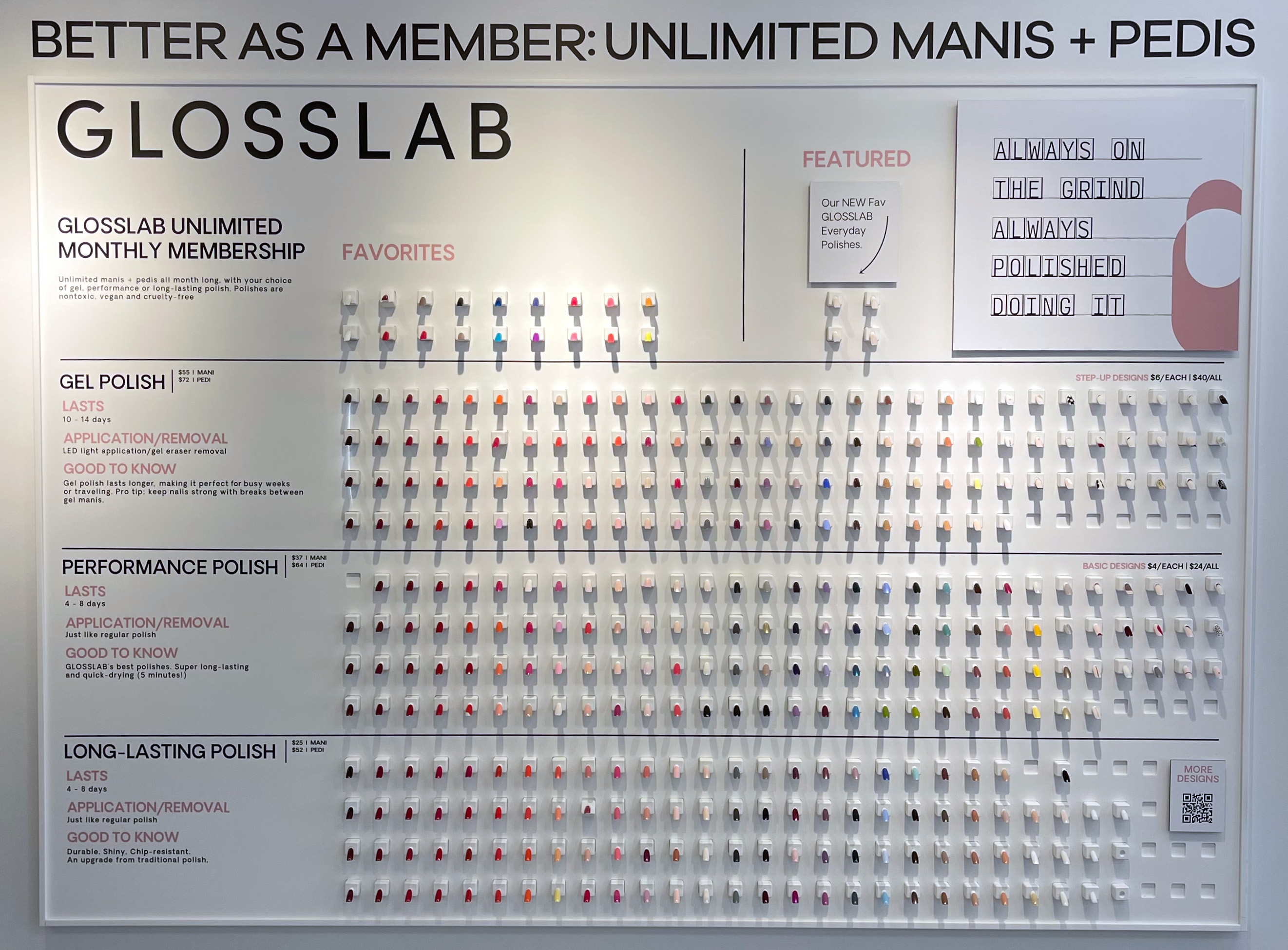
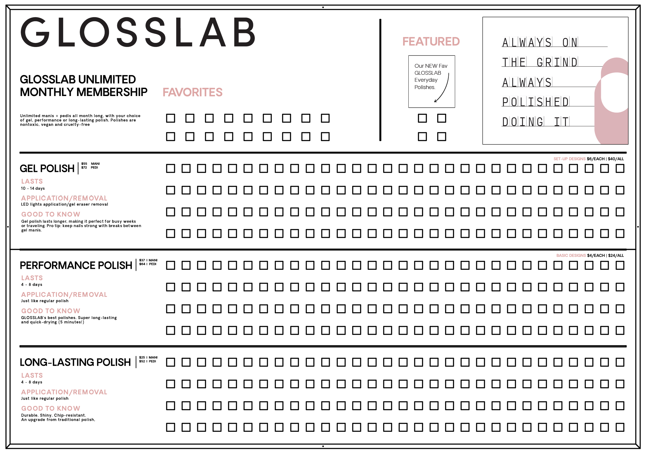
The Product Charts and Polish Wall were designed for in-store and web use. Scaled to size, assets are presented across all locations on shelves and represented online.
The Product Charts and Polish Wall were designed for in-store and web use. Scaled to size, assets are presented across all locations on shelves and represented online.
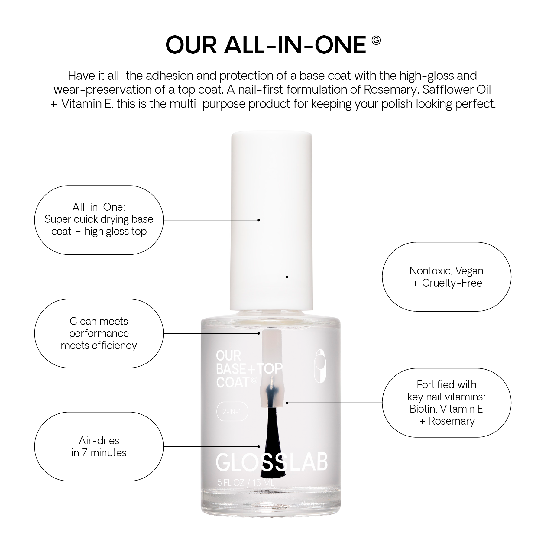
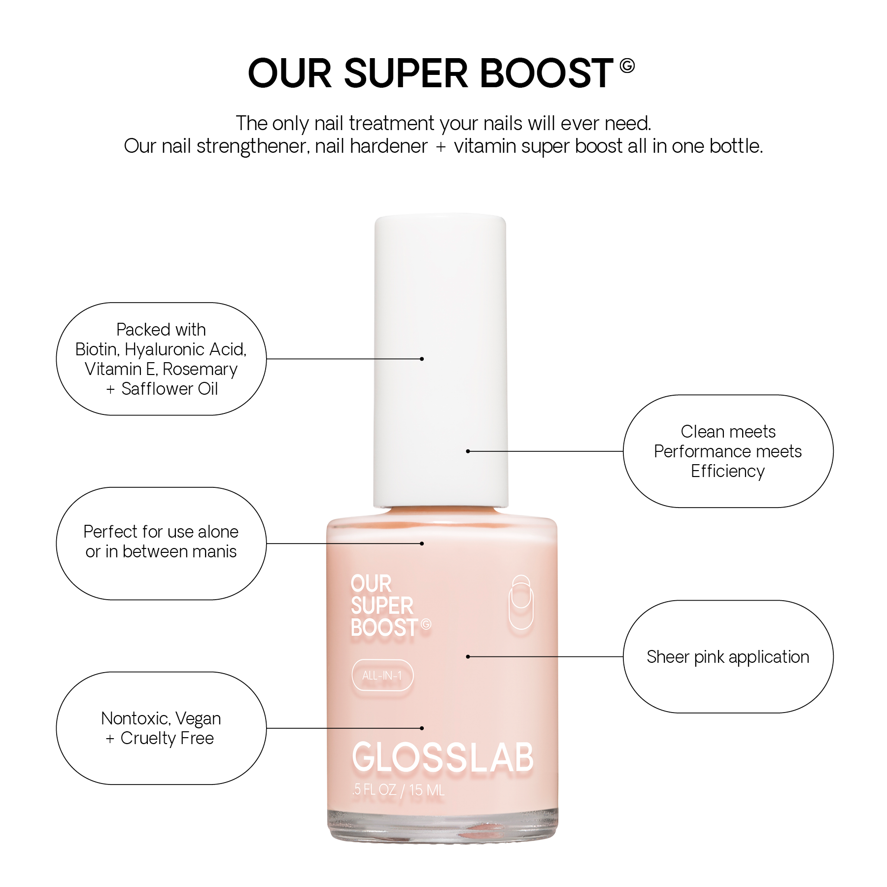

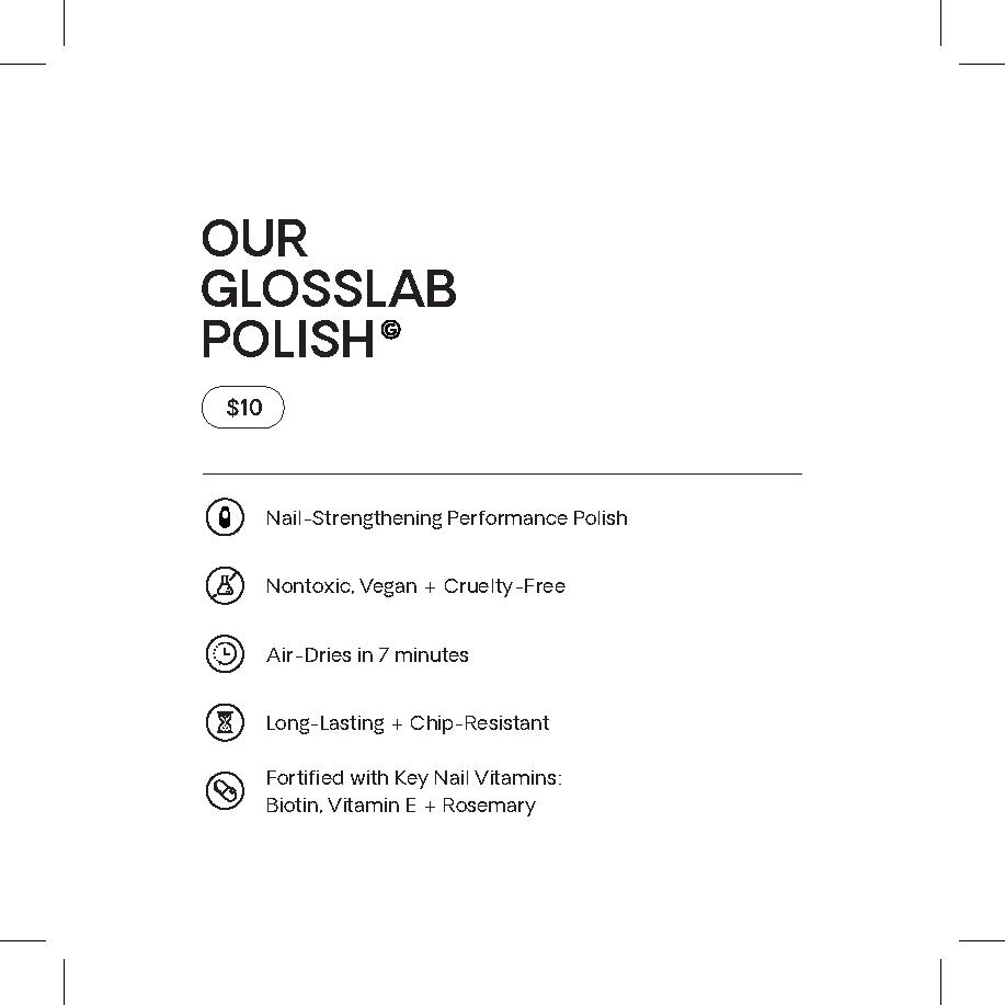
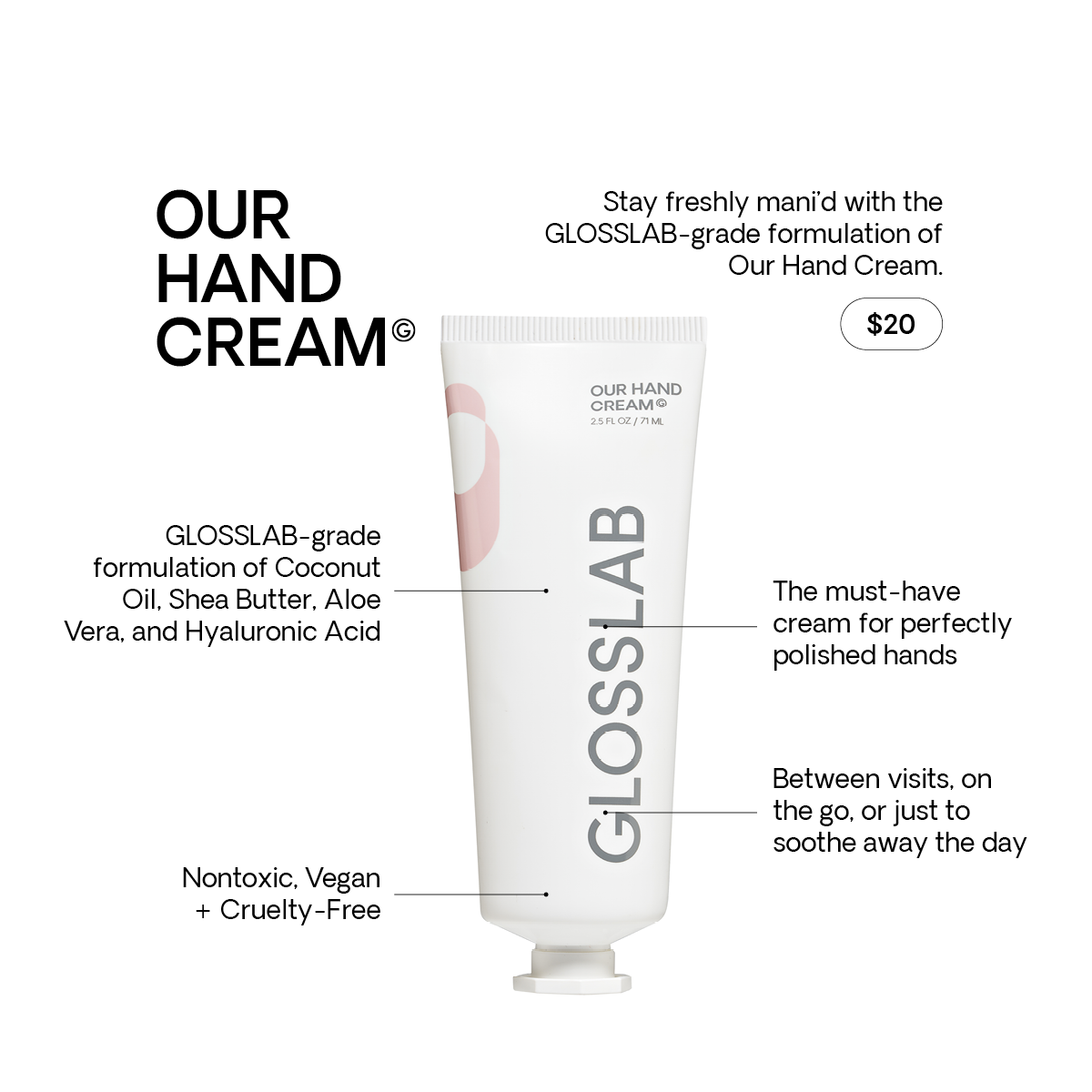
At GLOSSLAB, our main challenge was creating “Shelf-Talkers” that were to be used on shelves at a 4x4 in. dimension within the several locations across the country. These Shelf Talkers include multiple pieces of information about each product, and were therefore designed with readability in mind. Using hierarchical and contrasting design, we compartmentalized the most important information in separate fact bubbles. These Shelf Talkers also were designed for web use in mind.
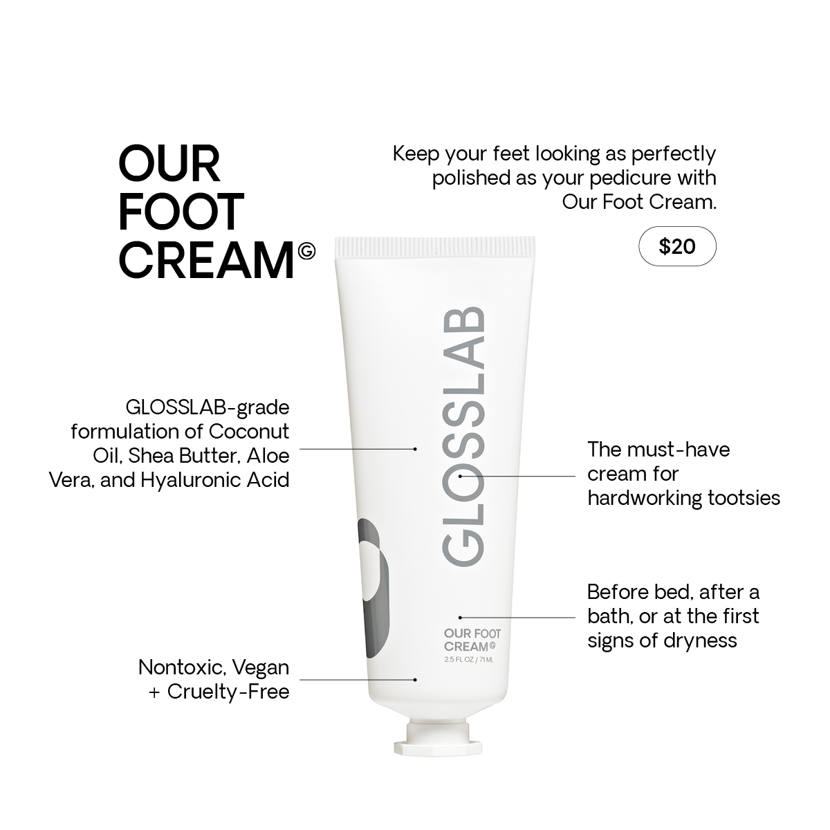
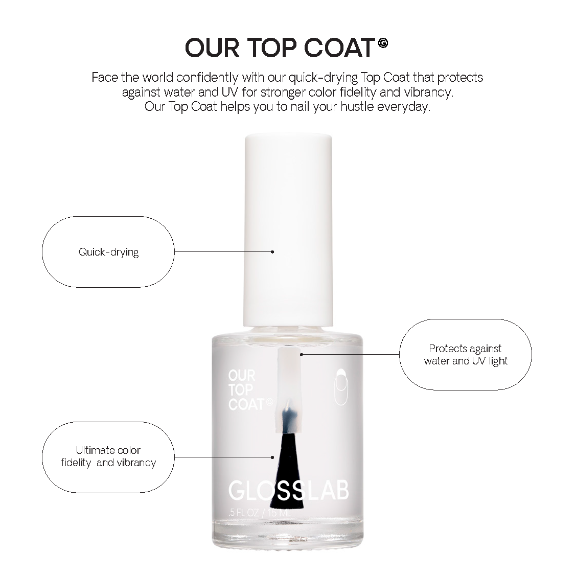
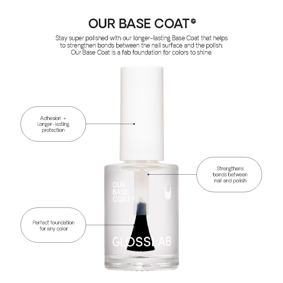
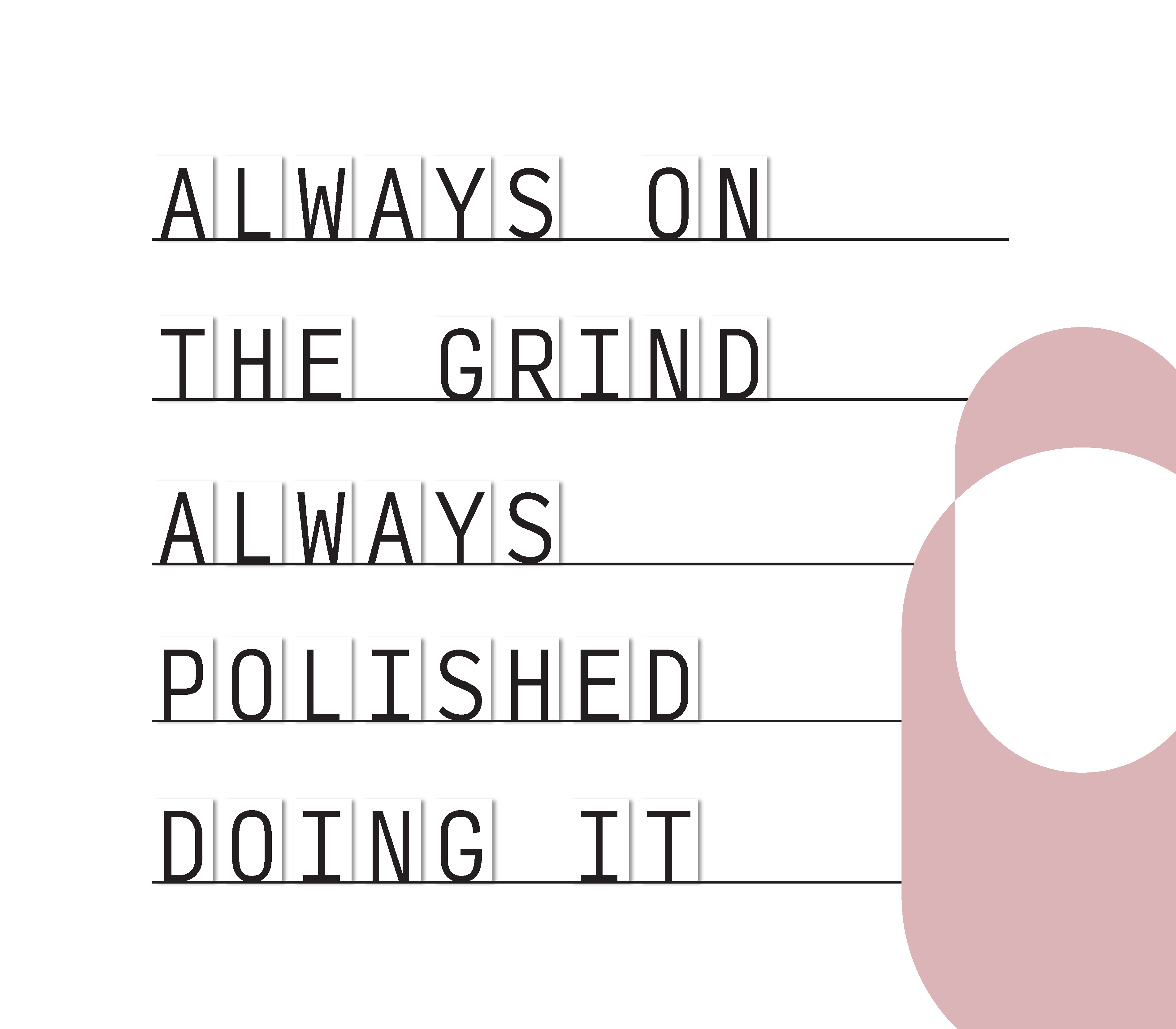
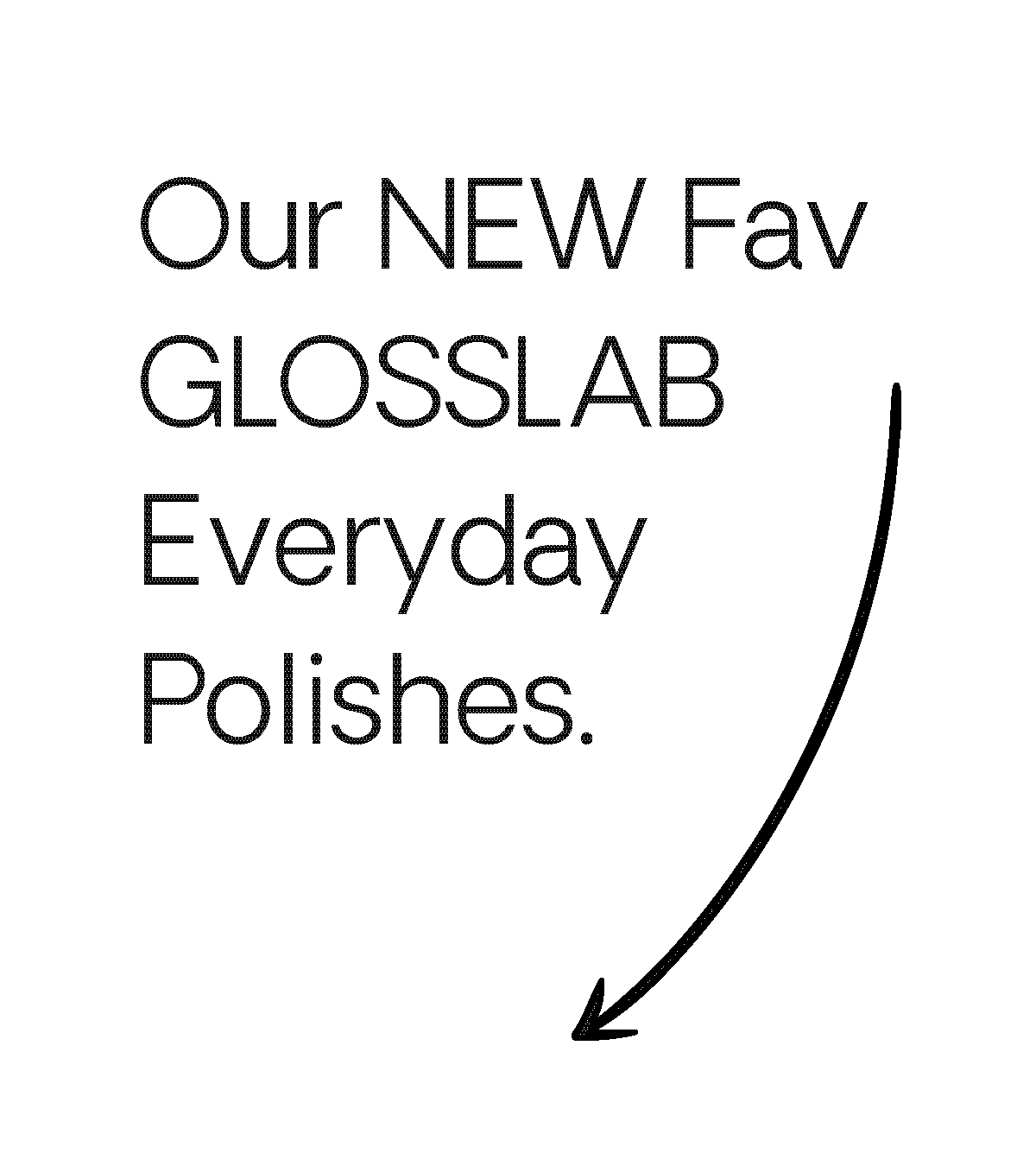
Our other task was to finalize assets for the Polish Wall, featured in every GLOSSLAB location. Each asset is interchangeable and here we prioritized functionality and cleanliness. The assets along the right side serve as magnets and were designed to bring a fresh and fun component to the Polish Wall with the ability to change out the showcased slogan.
